Overview
For this project, I redesigned the Starbucks mobile app with a strong focus on the user experience. My goal was to make navigation more straightforward, streamline the ordering process, and improve visual hierarchy—while staying true to Starbucks’ branding and style. Using iterative prototyping and usability testing, I worked to build an app experience that feels more intuitive, seamless, and enjoyable for everyday users.
Problem
Through research and user interviews, many people expressed that the app feels cluttered, navigation is unclear, and the design lacks consistency across screens. Common points included difficulties with ordering ahead, finding rewards, and customizing drinks—tasks that users found both frustrating and time-consuming.
Goals
- Simplify navigation
- Highlight rewards and key actions to improve engagement
- Enhance accessibility and streamline the ordering process
Design Process
I followed a user-centered approach:
- Conducted a heuristic analysis of the existing app
- Created wireframes for key user flows
- Tested with mock users using prototypes (Figma)
- Iterated designs based on usability feedback
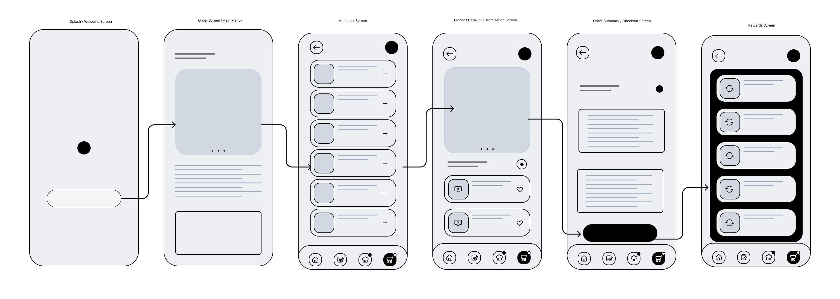
Final Designs
The redesigned home screen brings ordering to the forefront, removing distractions like ads and promotions so users can focus on the task at hand. A streamlined bottom navigation bar improves wayfinding, while larger buttons and a simplified customization flow reduce friction in the ordering process. Based on feedback from user interviews and usability testing, this layout prioritizes speed and ease of use for frequent customers. The updated color palette and typography maintain Starbucks' recognizable brand while improving visual hierarchy and accessibility.
Figma Design
Outcome
This redesign was shaped by real user feedback — people felt the original app was too cluttered, hard to navigate, and just not enjoyable to use. I focused on simplifying the experience and making it easier to complete everyday tasks like ordering ahead, customizing drinks, or checking rewards. With a cleaner layout, more intuitive navigation, and a more consistent visual style, the app now feels more aligned with what users actually want. The bottom navigation helps users move through the app without getting lost, and the new home screen prioritizes ordering without unnecessary distractions. I also redesigned the drink customization flow to be quicker and less frustrating, especially for regular customers. Throughout the process, I made sure the design stayed true to the Starbucks brand — but more focused on usability and accessibility. Overall, this project led to a more polished, user-friendly app that’s easier to navigate, more rewarding to use, and better suited to everyday habits.
← Back to Portfolio